
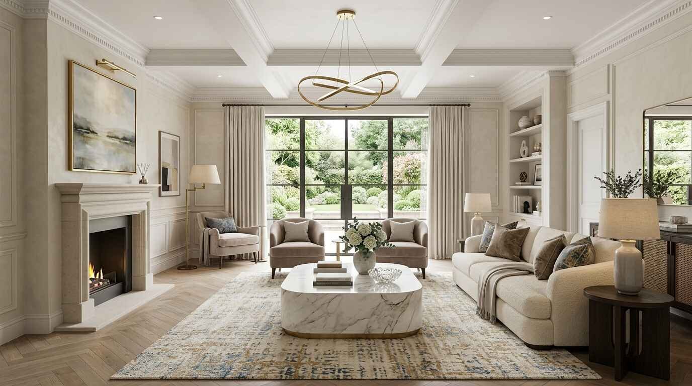
Choosing the right color palette is one of the most important decisions when designing an elegant living room. A thoughtful color scheme can influence the mood of the space, complement architectural features, and provide a cohesive backdrop for furniture and decorative details. When exploring luxury living room color ideas, the goal is to balance warmth, contrast, and visual depth without making the room feel overwhelming.
Whether you prefer serene neutrals, earthy tones, or deeper shades, a sophisticated living room color palette depends on understanding undertones, considering natural light, and coordinating colors with the existing architecture and finishes. The following 14 color combinations offer practical starting points for creating an elegant and comfortable living room.
14 Luxury Living Room Color Ideas
1. Warm White and Cream
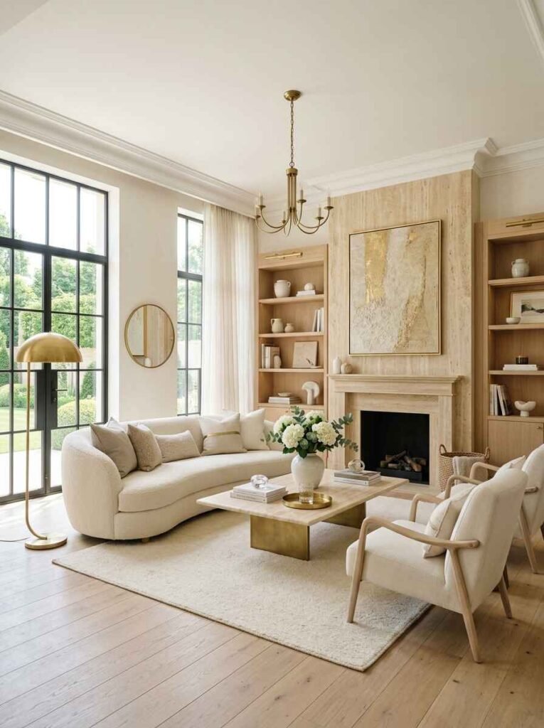
Warm whites and creams provide an airy and spacious space that is more soft than clinical. Contrary to the very cold nature of cooler whites, warm whites possess slight hints of yellows, peaches, or even reds, which make them perfect for reacting to natural daylight.
In order to achieve this palette successfully, one should complement the creamy colors of the walls with off-whites used as a trim in a satin finish, which will accentuate the millwork. It is best suited for southern exposures with an abundance of sunlight, which will bring out the buttery color of the walls. These can be combined with light stones, light oak, and warm metals like brushed brass.
2. Beige and Taupe
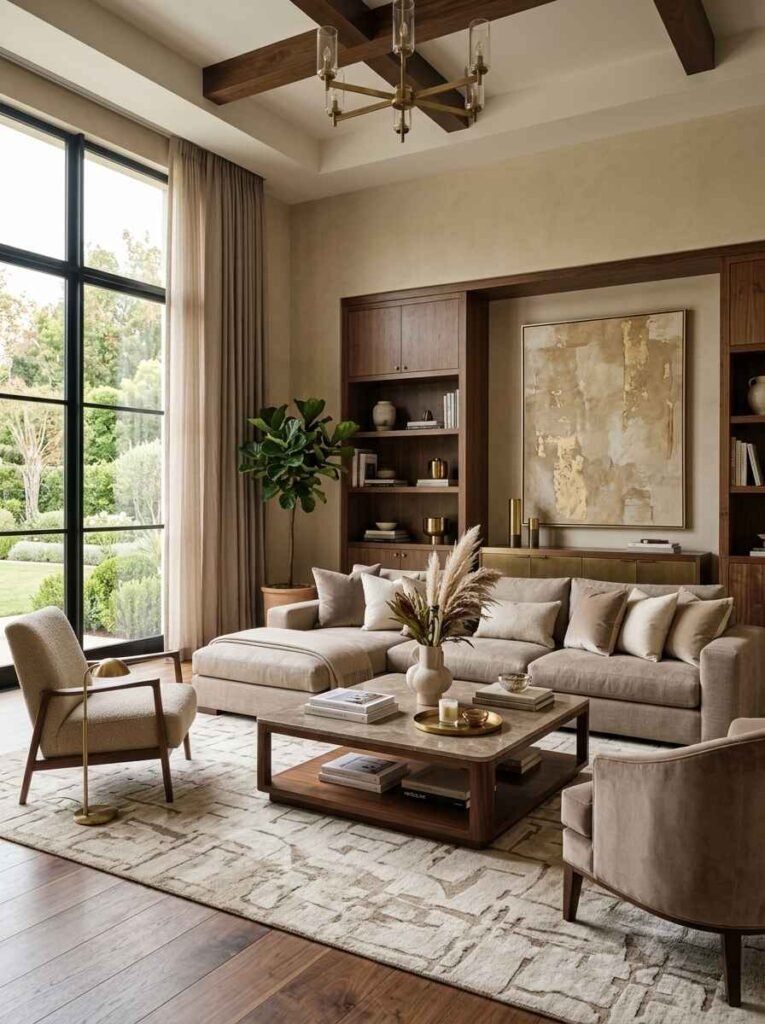
Beige and taupe add to your interior décor in a classic manner. The taupe color adds to your interior décor in the form of being a chameleon that is a combination of grey and brown, and as a result, it will keep the beige color from looking too yellowish.
The use of taupe on the walls of your home will make sure that any excessive sunlight is absorbed without making your rooms look harsh. Use taupe in moderation on primary walls and beige colors on other elements.
3. Greige and Warm White
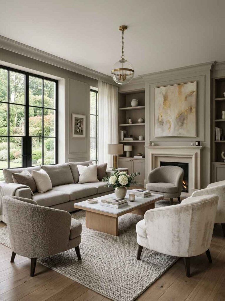
The color greige, which is a combination of grey and beige, not only provides a modern look with grey but also a comfortable one with beige. This color, when combined with warm white, gives you contrast without being too rigid or cold.
A color like greige is useful for northern-exposed areas, where there will be cool sunlight. Greige acts as a solution to this problem, whereas warm white can be used to paint ceilings and molding to make the room appear larger.
4. Mushroom and Soft Brown
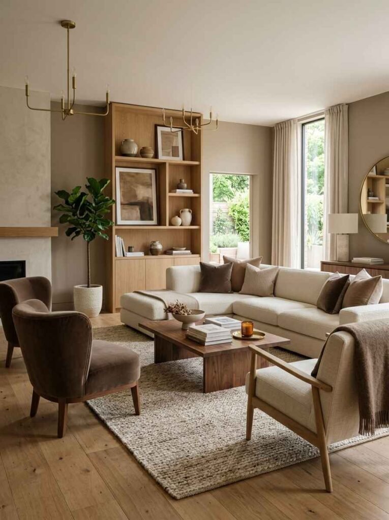
The mushroom color scheme has the color brown with subtle hints of gray. This makes it an excellent choice for creating a serene background with a modern feel.
It is best suited for moderately lit rooms. With walls painted in mushroom, the room is contrasted by lighter brown elements of architecture or walnut furniture or even leather. Using a darker color on doorways or inbuilt shelving helps achieve structural depth.
Still unsure which shades work well together? Our Living Room Color Palette Guide offers carefully selected color combinations designed to make choosing a cohesive living room palette easier.
5. Layered Earth-Tone Color Palette
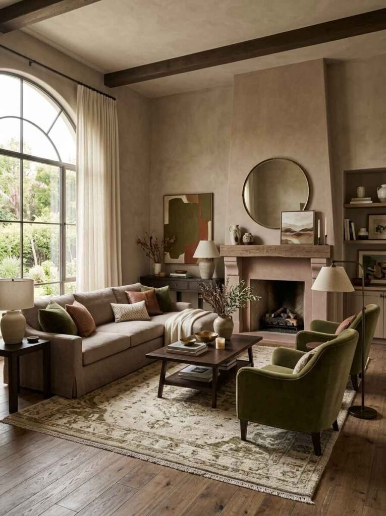
An earthy palette of colors can be taken from such natural elements as terracotta, ochre, clay, and moss green. In contrast to other palettes that are based on one predominant color, an earth tones palette consists of warm colors with equal tonal values.
In order to work with earth tones effectively, you should know how to balance plaster or sand-colored walls with clay or olive colors. Such a combination of colors will work perfectly for open plan living rooms.
6. Olive Green and Natural Wood
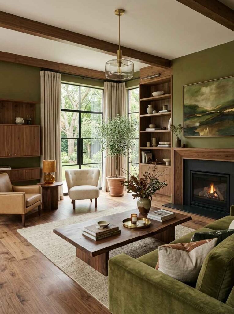
Undertones of yellow and brown make olive green an extremely versatile saturated color for elegant interiors. This color combination with natural wood tones brings the feeling of comfort, like in a library.
The walls of deep olive green create a contrast with natural wood tones such as dark oak or walnut trim. In rooms where many plants are visible through the window, olive green gives the impression that nature comes into the room.
7. Sage Green and Cream
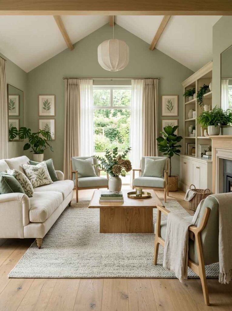
Sage green provides a soft, muted color option with subtle grey undertones that evoke calm and restraint. Pairing sage green with rich cream prevents the green from reading too cool or washed out.
Sage green works well in smaller or lower-ceilinged spaces because light green shades reflect ambient light softly across surfaces. Painting walls in matte sage green alongside cream trim adds architectural detail while keeping the visual visual weight light and relaxed.
8. Deep Forest Green and Warm Neutrals
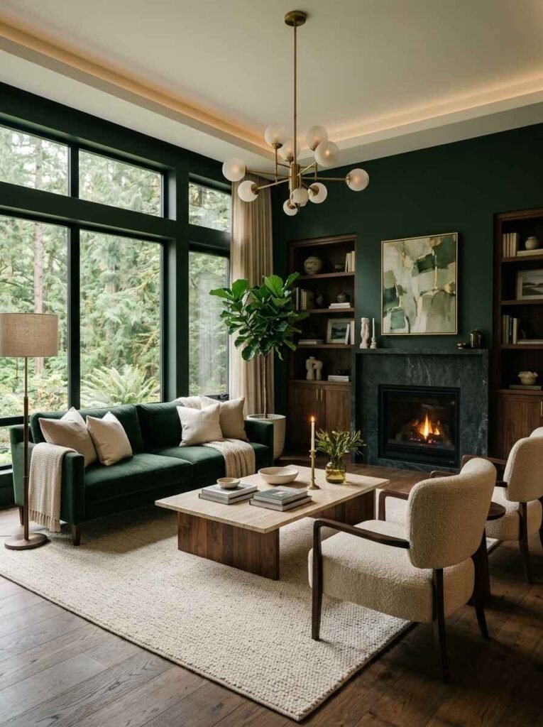
For places that have been made for nighttime socializing or a relaxing atmosphere, the forest green is an intense color that will create a sense of drama. This cool hue should be complemented with warm neutrals such as almond, sand, and warm grey tones.
Due to the fact that forest green can absorb a lot of light, this is a suitable color for rooms with abundant natural lighting and also moody lighting created within the architecture of the building.
9. Soft Blue and Warm White
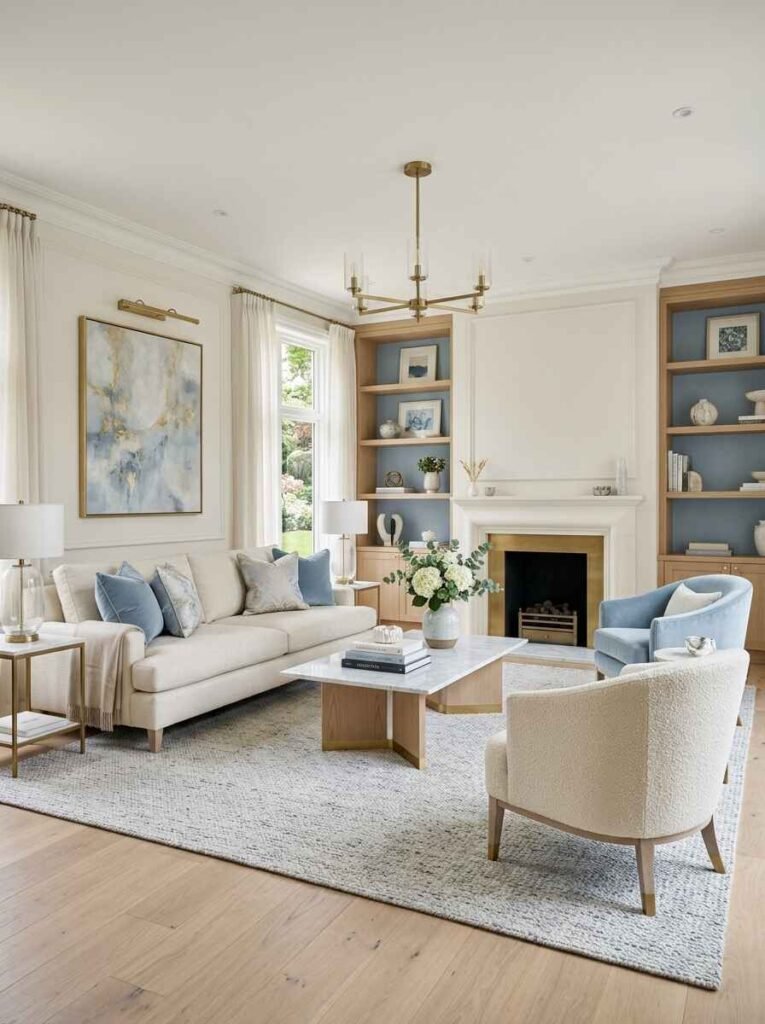
Soft blue brings a sense of quiet clarity to high-end interiors. When paired with warm white, it keeps a living room airy without feeling cold.
To ensure blue feels sophisticated rather than icy, choose soft powder or slate-infused blues with grey or green undertones. Using warm white on surrounding walls while applying soft blue to recessed millwork, shelving backings, or ceiling bays draws the eye upward while maintaining an inviting atmosphere.
10. Chocolate Brown and Ivory
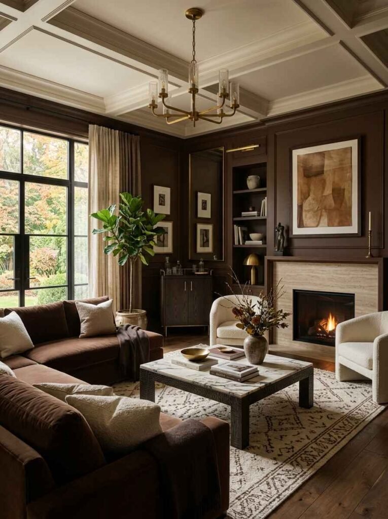
Chocolate brown introduces deep, enveloping luxury to formal living spaces. Ivory offers a soft, radiant counterpoint that keeps the darkness of brown grounded and intentional.
Rich brown wall finishes—such as limewash, venetian plaster, or matte dark paint—absorb light and add texture. Highlighting these walls with ivory architectural trim, marble surfaces, or lighter floor finishes prevents the room from feeling closed off, resulting in an intimate layout.
11. Dusty Blue and Taupe
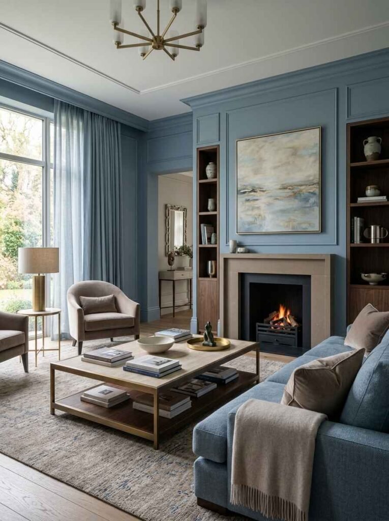
The dusty blue has many undertones of grey and lavender, thus making the regular blue a complex color. The combination of this blue color with the taupe is a good mix of coolness and warmth.
The color scheme works perfectly well for transitional rooms where there is a blend between the traditional architecture moldings and the contemporary furniture lines. The dusty blue is great on the wood wall panels, while the taupe color paint complements it well.
12. Muted Burgundy and Cream
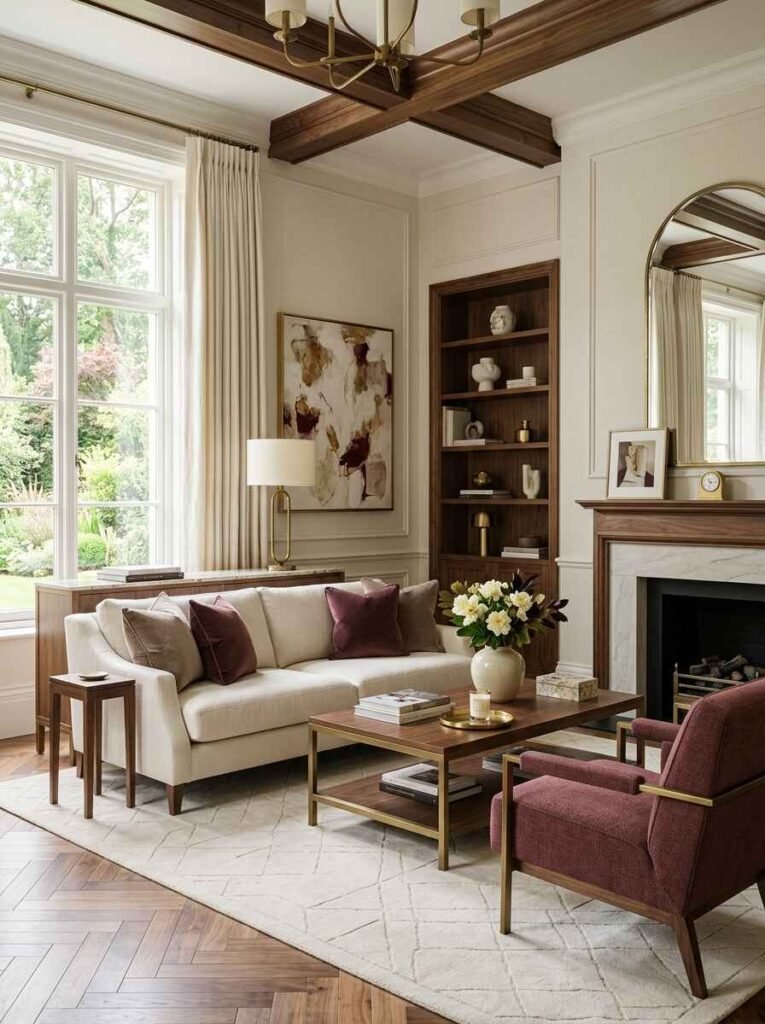
The muted version of the burgundy color is a rich red color toned down by brown or gray. It provides warmth and history but without the brassy look and loud appearance.
Employing burgundy colors appropriately like in accent walls, alcoves, or architectural elements as a border enhances cream walls. This is because the cream color diminishes the richness of the burgundy color.
13. Charcoal and Cream
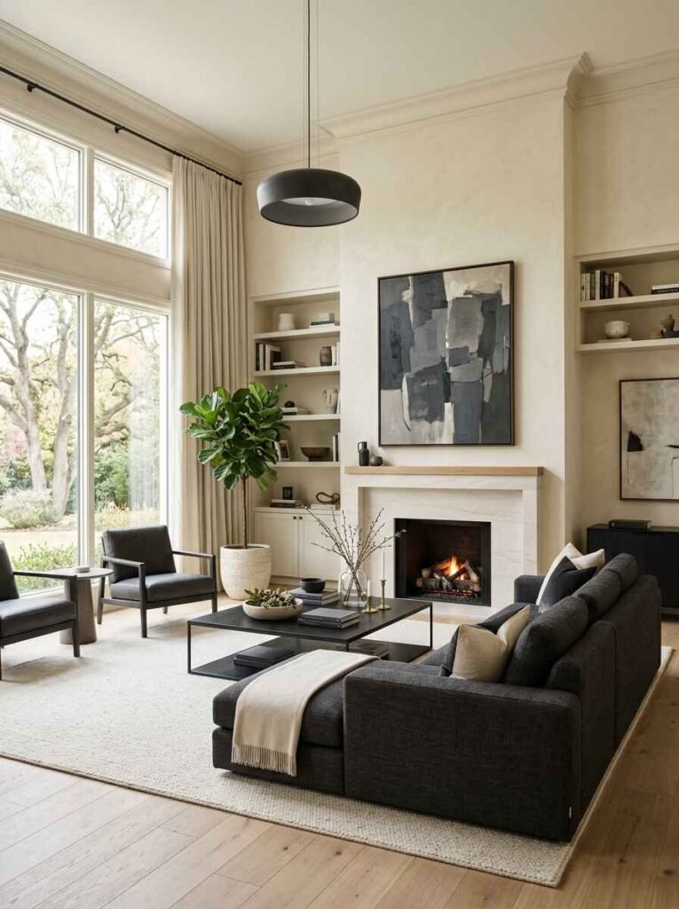
Charcoal exudes contemporary elegance. Using charcoal grey instead of black helps create high contrast and yet maintains accessibility in the room.
Using charcoal with cream instead of white creates a smoother transition from dark and light components in the space. Charcoal works well for accents such as accent walls, window mullions, and custom-made bookcases.
14. Terracotta and Warm Beige
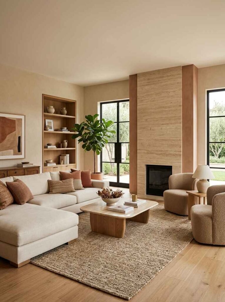
Terracotta offers the earthiness and Mediterranean style of a warmer look. The colors of terracotta, consisting of clay, orange, and red, give off a very warm visual appeal.
When combined with warm beige color, the terracotta becomes less vibrant and makes for a good backdrop. This combination works especially well in spaces that are decorated with limewashed or plastered walls since the light will reflect from the colors unevenly.
Evaluate Natural Light Direction
Light direction impacts how colors appear on your walls throughout the day:
- North-Facing Light: Cool, bluish light flatters warm neutrals like beige, greige, and mushroom, balancing chilly undertones.
- South-Facing Light: Intense, warm sun highlights yellow undertones in paint. Cooler shades, dusty blues, and soft greens thrive here.
- East-Facing Light: Warm and bright in the morning, turning cooler by afternoon. Soft greens and muted neutrals transition smoothly across these shifts.
- West-Facing Light: Low, golden light in the late afternoon intensifies warm shades like terracotta and burgundy, while making cool grays look flat.
Consider Fixed Architectural Finishes
Your living room’s permanent elements—floors, stone, and built-in woodwork—dictate your color boundaries.
Identify the undertones in your flooring: oak with grey undertones pairs well with charcoal or dusty blue, while red oak or walnut demands warm whites, creams, or forest greens. For more tailored design direction, explore our guide on Luxury Living Room Ideas.
Apply Color Proportions
A helpful guideline for visual balance is distributing colors proportionally across the room:
- Primary Tone (60%): Walls, ceilings, or large architectural surfaces.
- Secondary Tone (30%): Built-ins, trim, major accents, or focal walls.
- Accent Tone (10%): Highlight details, doors, or niche interiors.
How to Make Living Room Colors Look More Expensive
Beyond paint selection, how color is applied across textures and surfaces determines the final look.
- Use Low-Luster Finishes: Matte, flat, or eggshell finishes absorb light evenly, minimizing surface imperfections and creating a velvety look.
- Color-Drench the Architectural Details: Painting walls, baseboards, door frames, and crown molding in a single color creates an expansive visual field.
- Introduce Plaster and Venetian Lime Finishes: Venetian plaster or limewash introduces subtle tone-on-tone texture that adds depth to neutral or earthy walls.
- Select Tone-on-Tone Wood Stains: Coordinate dark wood trims with wall colors containing matching undertones to create a cohesive backdrop.
- Balance Sheens Across Features: Use matte paint on walls combined with satin or semi-gloss finish on trim to subtly draw out architectural detail without contrasting colors.
Luxury Living Room Color Mistakes to Avoid
Avoiding common color application mistakes helps maintain a tailored atmosphere across your living space:
- Ignoring Paint Undertones: Mixing cool pink undertones with warm yellow undertones creates visual friction. Always test swatches side-by-side against fixed finishes.
- Overusing Pure Stark White: Pure white paint often lacks depth and can read as sterile or unfinished under natural light.
- Testing Paint Swatches on Small Cards: Small paper swatches don’t capture how light moves across large wall surfaces. Paint at least 2×2 foot samples directly on multiple walls.
- Selecting Paint Before Main Materials: Paint options are nearly limitless, while luxury wood, marble, and upholstery options are finite. Always select key materials first, then match your wall paint.
- Neglecting the Ceiling Tone: Leaving ceilings in bright builder’s white breaks the continuity of dark or warm neutral rooms. Tint ceiling paint slightly to match wall undertones.
For advice on arranging your space around your chosen palette, review our breakdown on Luxury Living Room Layout concepts, or discover how to select complementary furniture tones in our piece on Luxury Living Room Furniture Ideas.
Frequently Asked Questions
What are the most timeless colors for a luxury living room?
Warm whites, beige, greige, and mushroom shades remain the most timeless choices. These neutrals provide a flexible base that accommodates evolving decor trends while maintaining an elevated baseline.
How do dark wall colors affect the perceived size of a living room?
Dark shades like deep forest green, chocolate brown, and charcoal absorb light, blurring structural corners. This effect can make walls feel like they recede, creating depth and intimacy rather than simply making the room feel smaller.
Is greige still a modern option for high-end interiors?
Yes, greige remains a flexible modern neutral. It balances cool grey and warm beige, preventing rooms from feeling too sterile in cool light or overly warm in direct sun.
Should living room walls and trim be painted the same color?
Painting walls and trim the same color—known as color drenching—creates a clean look that elevates low ceilings and softens aggressive architectural transitions. Using slightly higher paint sheens on trim adds subtle definition.
How do I choose between cool and warm neutrals?
Select your neutral based on room orientation and flooring undertones. Cool light (north-facing) benefits from warm neutrals to add comfort, while warm light (south-facing) pairs well with cool or muted neutrals.
Can bold colors look elegant in a formal living room?
Yes, bold colors like burgundy, terracotta, or deep forest green look elegant when they contain grey, brown, or black undertones. Muted undertones reduce harsh saturation, yielding a rich, tailored finish.
Conclusion
A sophisticated choice of colors for a living room is not only about picking nice-looking shades. Think about lighting, architectural finishes, tones, contrasts, and how colors go together. Warm whites, neutral layers, earthy greens, soft blues, rich browns, and accent colors in moderation can all serve to create a sophisticated base if they match the living room well.
Try out your favorite shades on the walls of the room first, and design the color palette depending on the architecture and furniture you have in it. Using color relationships and contrasts properly, you will be able to create a sophisticated and harmonious living room that does not need to be decorated excessively.
2 thoughts on “14 Luxury Living Room Color Ideas for an Elegant Home”
Comments are closed.